


Quilts and Color, The Pilgrim/Roy Collection
This archive article was originally published in Summer 2014 issue of Antiques & Fine Art Magazine.

- Fig. 1: Log Cabin, Barn Raising Variation quilt, attributed to Mrs. Herrick, Massachusetts, 1879. Foundation pieced top of cotton and silk in variety of structures including silk velvet with silk embroidery, silk plain weave backing quilted to unknown material . 75½ x 75 inches. Pilgrim/Roy Collection. Photograph © Museum of Fine Arts, Boston.
In the late 1960s, when Gerald Roy and Paul Pilgrim first saw Mrs. Herrick’s 1879 Log Cabin, Barn Raising Variation quilt (Fig. 1), they were struck by her masterful orchestration of color. At that moment, they agreed, “This has nothing to do with staying warm. This is art.” As artists trained at the Oakland College of Arts and Crafts and other American art schools influenced by expatriate former Bauhaus faculty, they were attuned to the relationship between color and abstraction. While Pilgrim and Roy had been acquiring quilts for several years for their gallery in Oakland, California, none seemed prescient of the mid-century geometric compositions of Josef Albers in the way Mrs. Herrick’s Log Cabin did. The revelation that quilts could be, in Roy’s words, “art,” sparked a deep interest leading to their acquisition of over 1,200 examples. As their collection grew, so did their role in the quilt world. According to Gerald Roy, together they became “…searchers, gatherers, keepers, conservators, historians, makers, and teachers—teaching being the most rewarding.”
Pilgrim and Roy were initially drawn to pieced quilts that showed a range of color phenomena—from the bold combinations of orange and blue found in Mennonite quilts to more subtle color combinations of low contrast, like the deep, saturated colors of Amish quilts. With their expanding knowledge, Pilgrim and Roy broadened their interests to include quilts that contrasted dark elements with white. As their collection grew, they explored variations of specific patterns, such as the ubiquitous Log Cabin, and sought out illusionistic quilts with dynamic color combinations. After many years of looking at quilts, listening to quiltmakers, and becoming quiltmakers themselves, Pilgrim and Roy became most intrigued by unorthodox quilts that departed from standard palettes or prescribed patterns.
|
|

 top and printed cotton plain weave back, wool twill tape binding; quilted. 86 x 78 inches. Acquired from the Pilgrim/Roy collection by the MFA with funds from the Mary S. and Edward J. Holmes Fund. Photograph © Museum of Fine Arts, Boston.")
, 1965. Screen print in gray-blue and orange. 26 x 26 inches. Gift of Neville A. Powers. Art © Richard Anuszkiewicz/Licensed by VAGA, New York, NY. Photograph © Museum of Fine Arts, Boston.")
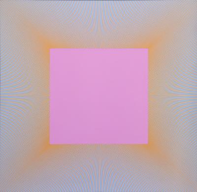
- Fig. 4: Untitled, Richard Anuszkiewicz (American, born in 1930), 1965. Screen print in gray-blue and orange. 26 x 26 inches. Gift of Neville A. Powers. Art © Richard Anuszkiewicz/Licensed by VAGA, New York, NY. Photograph © Museum of Fine Arts, Boston.

- Fig. 5: Yellow Baskets quilt, 1920-1939. Pieced cotton sateen or satin top, cotton satin or sateen back; quilted. 94¾ x 82 inches. Pilgrim/Roy Collection. Photograph © Museum of Fine Arts, Boston.
The status of quilts rose in the art world soon after Pilgrim and Roy began collecting. Non-functional quilts made to ornament furniture or hang on walls had been exhibited and celebrated for decades before the summer of 1971, when Abstract Design in American Quilts opened at the Whitney Museum of American Art. In this groundbreaking exhibition, quilts were hung on gallery walls, like paintings. For the first time quilts were nationally recognized as masterpieces of art, without regard to craftsmanship or provenance. Featuring quilts from the collection of Jonathan Holstein and Gail van der Hoof, who were contemporaries of Pilgrim and Roy, this exhibition was lauded by prominent art critic Hilton Cramer, writing in his review for The New York Times, “For a century or more preceding the self-conscious invention of pictorial abstraction in European painting, the anonymous quilt-makers of the American provinces created a remarkable succession of visual masterpieces that anticipated many of the forms that were later prized for their originality and courage.” 1 By garnering the attention of the New York art establishment, American quilts soon became fodder in the debate among art critics, feminists, and artists about fine art versus craft, folk art versus fine art, and female versus male art forms.2 While decades of seeing a range of objects displayed as art in museums have left many inured to this controversy, the Whitney exhibition inaugurated a revival in quilt making that embraced non-functional quilts and catalyzed a broader interest in quilt collecting—both of which persist today.
The Mennonite Scherenschnitte quilt in the Pilgrim/Roy collection (Fig. 2) illustrates the visual phenomenon of simultaneous contrast or, as Josef Albers described it, “vibrating boundaries.” Although many Mennonite quilts in the Pilgrim/Roy collection exploit the juxtaposition of complementary colors of equal saturation and intensity, clearly other quiltmakers had a working knowledge of this aspect of color theory as well. In the Log Cabin, Windmill Variation made in the late nineteenth century in Ohio, adjacent strips of orange and blue cloth and neighboring strips of yellow and violet cloth radiate from red squares set on point (Fig. 3). The visual impact of such vibrant quilts, with their intense colors and geometric compositions, is echoed in the work of Op Artists, such as Richard Anuszkiewicz. In his untitled print from 1965 (Fig. 4), the flickering edges of the orange and blue forms can be found in many Mennonite quilts made decades earlier.
A number of the quilts in the Pilgrim/ Roy collection illustrate how quiltmakers lowered the contrast between light and dark elements, allowing greater color interaction—the quality that interested Pilgrim and Roy the most. In the Yellow Baskets quilt (Fig. 5) made in the 1920s–1930s, probably in upstate New York, white surrounds yellow basket motifs. Because yellow is the lightest primary color (or has the highest value) it is closest to white, and, according to Gerald Roy, is the hardest color with which to work. The basket motifs in most quilts of this pattern are much darker (or one of a lower value) than their white ground, but in this example the white ground and yellow motifs interact on the same visual plane. The Sunshine and Shadow quilt (Fig. 6), created in the 1880s in Pennsylvania, has concentric diamonds in a pattern of red, blue, yellow, and green. The square pieces of cloth within each band of color are arranged in gradations from the most saturated to the least intense. The gradations of color within each band play against the contrast of light and dark where each color meets—for example, pink is adjacent to dark blue and pale yellow is adjacent to dark green––creating tension, and in Gerald Roy’s words, “an exciting and visually active experience.”
|
|


- Fig. 8: Mariner’s Compass quilt, ca. 1840. Pieced printed cotton plain weave top, cotton plain weave back and binding; quilted. 89½ x 88¾ inches. Pilgrim/Roy Collection. Photograph © Museum of Fine Arts, Boston.
Their deep interest in color led Pilgrim and Roy to collect Amish quilts, which were among of the earliest quilts to be accepted as “art” because of their strong formal qualities. The fields of saturated colors in classic Lancaster County Amish quilts, such as the Framed Diamond in a Square (Fig. 7) made around 1890, resonated with those accustomed to viewing large abstract paintings on the walls of museums and galleries. While today it is understood that Amish quiltmakers adopted many of these patterns from their Welsh neighbors, the colors they chose stand out among American quilts. Amish quilts reminded Roy of Albers’ dismissal of pat color schemes and seemingly pleasing color harmonies. Albers argued that because perception of color was personal and always in flux, students needed to go beyond their color preferences and prejudices to understand it and to use it effectively in their work.
After many years of seeking out quilts with strong color interaction, Pilgrim and Roy agreed that quilts of high contrast—or those that set off color with white—should also be included in their collection to represent mainstream American quiltmaking. The collectors were particularly drawn to quilts of high contrast that used white idiosyncratically. The Mariner’s Compass quilt, made in Massachusetts in the 1840s (Fig. 8), differed from typical examples with dark compass motifs on a light ground. As Gerald Roy explains, “Because of their degree of difficulty, Mariner’s Compass quilts are very sought after by collectors. This quilt, however, did not hold broad appeal because the setting of the plaid pattern was so visually ‘disturbing.’ But it was that quality alone that Paul and I found most interesting.”
The Log Cabin pattern, one of the most ubiquitous patterns in the late nineteenth and early twentieth centuries, gave Pilgrim and Roy ample opportunity to find distinctive examples that employed unexpected colors. This pattern is typically derived from square blocks with red centers around which strips of cloth are sewn to create a dark half and light half. The blocks can be arranged to create many different larger patterns, such as a checkerboard, concentric diamonds or squares, or diagonal rows.
, glazed cotton plain weave back, wool plain weave binding; quilted. 89 x 76¾ inches. Pilgrim/Roy Collection. Courtesy, Museum of Fine Arts, Boston.")
- Fig. 9: Field of Diamonds quilt, American, about 1860. Pieced wool plain weave and twill (some printed), glazed cotton plain weave back, wool plain weave binding; quilted. 89 x 76¾ inches. Pilgrim/Roy Collection. Courtesy, Museum of Fine Arts, Boston.

- Fig. 10: Double Wedding Ring quilt, African American, Missouri, circa 1940. Pieced cotton plain weave top, cotton plain weave back and binding; quilted. 82 x 83 inches. Pilgrim/Roy Collection. Photograph © Museum of Fine Arts, Boston.
Illusionistic patterns were also very popular in the early twentieth century, and, like Log Cabin variations, remain so today. The Field of Diamonds quilt (Fig. 9), made around 1860, is made of small hexagonal pieces of fabric sewn together to make a black grid that elicits shifting perceptions of stars, tumbling blocks, and rows of diamonds. The kaleidoscopic effect is enhanced by a secondary pattern of orange rings. Unlike most collectors, Pilgrim and Roy embraced the use of saturated orange and other bold colors contained in what Gerald Roy has described as “strong, dynamic, interesting, and wonderful quilts.”
Before Pilgrim’s untimely death in 1996, the collectors began acquiring quilts that went beyond traditional patterns in some way and spoke to the singularity of the quiltmakers—most of whom remain unidentified. The Double Wedding Ring quilt (Fig. 10), attributed to an African-American quiltmaker in Missouri encapsulates this change of focus. A popular pattern in 1930s, Double Wedding quilts usually have pieced rings of pastel-colored printed fabrics on an off-white ground, in contrast to the bold colors in this example, which has inspired Gerald Roy to comment, “This quilt celebrates what color has to offer.”
Pilgrim and Roy’s quilt collection stands apart in its conception and development, a collection that took shape in ways they could not have anticipated on the day they encountered Mrs. Herrick’s Log Cabin quilt more than fifty years ago (fig. 1). Like the colorful links in the Double Wedding Ring quilt, the Pilgrim/Roy Collection embodies not only their collecting vision but their deep and broad connections in the quilt world and these extraordinary works of art.

The exhibition Quilts and Color: The Pilgrim/Roy Collection was on view at the Museum of Fine Arts, Boston (MFA), April 6 through July 27, 2014. An accompanying catalog invites visitors to see quilts through the eyes of these two visionary collectors. For information, visit www.mfa.org.

Jennifer Swope is consulting curator of the exhibition.
This article was originally published in the Summer 2014 issue of Antiques & Fine Art magazine, a fully digitized version of which is available at afamag.com. AFA is affiliated with Incollect.
2. In his review, Hilton Kramer suggested that the sophistication of the quilts in the exhibition questioned the relation of high art to the lesser arts. The exhibition inspired Patricia Mainardi to posit that needlework was the true female art and should be studied as such by feminist historians; “Quilts: The Great American Art” in the Feminist Art Journal 2, no. 1 (Winter 1973): 18–23. See also Janet Catherine Berlo, “Acts of Pride, Desperation, and Necessity: Aesthetics, Social History, and American Quilts,” in Wild by Design: Two Hundred Years of Innovation and Artistry in American Quilts, ed. Janet Catherine Berlo et al. (Lincoln, NE: International Quilt Study Center; Seattle: University of Washington Press, 2003), and Catherine Morris, “Workt by Hand”: Hidden Labor and Historical Quilts (Brooklyn: Brooklyn Museum, 2013).