


A Team of Top Talents Designs An Upside Down Oceanside Retreat
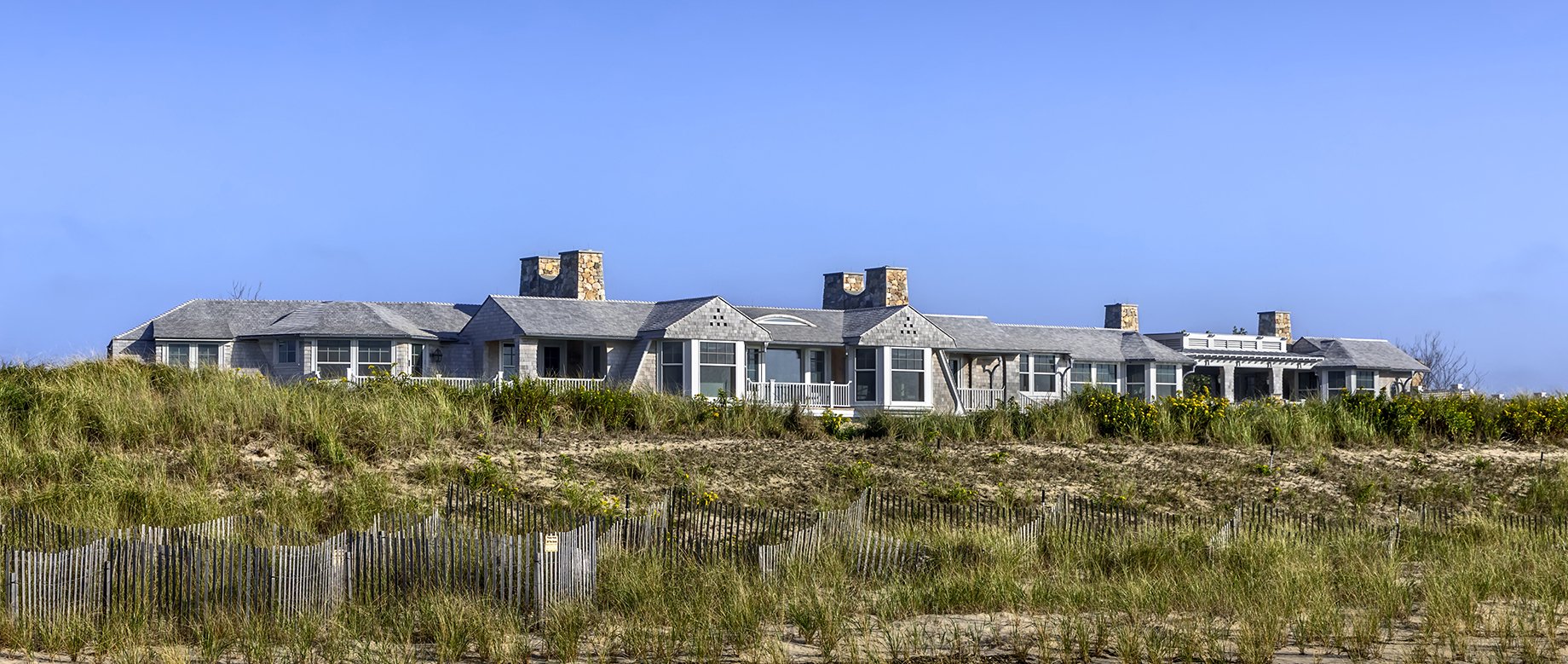 |
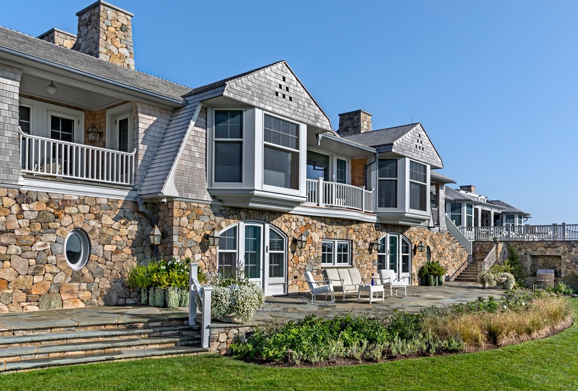
The view from the shoreline, across the protected dunes, to the upper level of the “Upside Down” house designed by Roger Seifter of Robert A. M. Stern Architects, with interiors by Mark Epstein of Mark Epstein Designs and landscape architecture by Edmund Hollander of Hollander Design Landscape Architects. Photo by Peter Aaron/OTTO |
 |
magine the perfect getaway dream house, where you and your family can be together without the distraction of schedules and logistics. A sprawling, rambling beauty that’s timeless, a touchstone to the past and a pathway to the future, where your children, your grandchildren, and future generations of your family will gather and celebrate the joy of being together. It should be a destination, to enhance your detachment from city life and foster anticipation for what’s to come. It should have awe-inspiring views. And it should be unstintingly comfortable and low key luxurious, big enough so that everyone and their friends are welcome for boisterous celebrations, and cozy enough to create intimate, cherished moments.
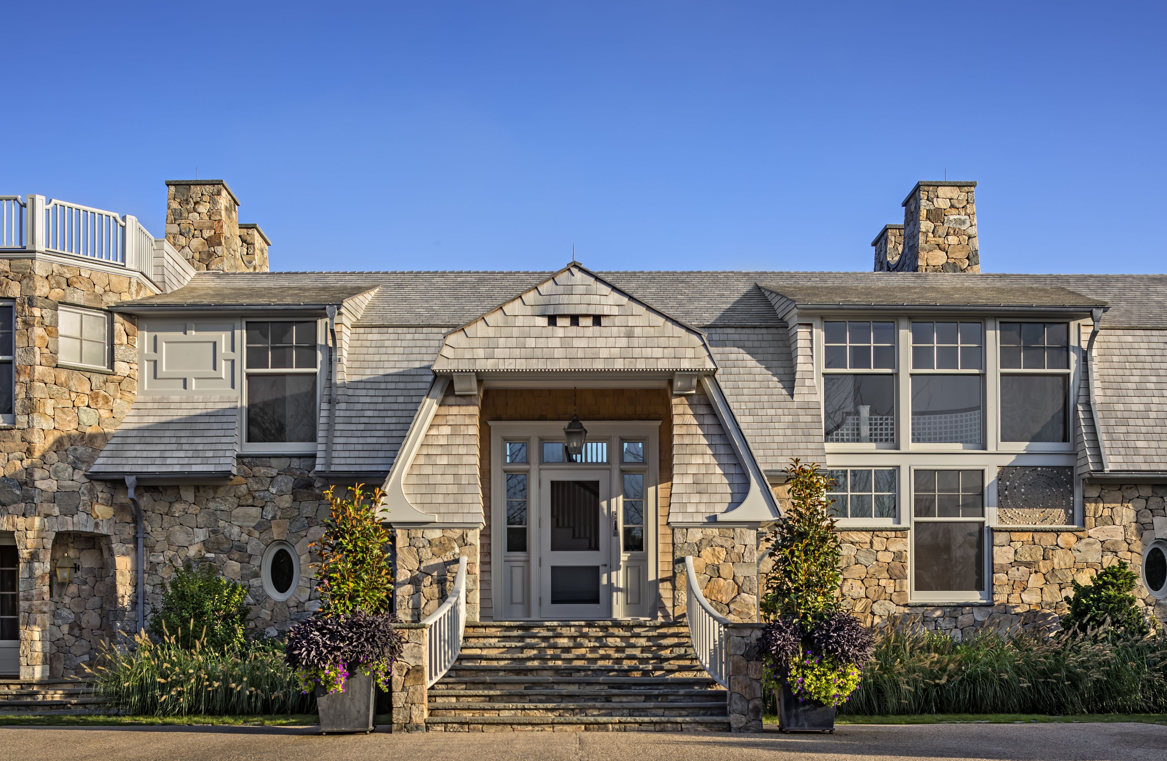 |
The entrance side of the house, showing the distinctive gambrels and flared eaves typical of shingle style architecture. At left, a tower is crowned by a roof deck. Photo by Peter Aaron/OTTO |
Step inside to tour this oceanside getaway house, and hear from the team who created it. Three visionaries, tops in their fields, each contributed his expertise and creativity to realize a dream house dedicated to family and friendship.
 |
 |
 |  |  | ||
Roger Seifter, Partner, | Mark Epstein, Interior Designer, | Edmund Hollander, Landscape Architect, Hollander Design Landscape Architects |
 |
Q / Incollect: Roger, tell a little about the process and how things came together after you saw the site and started drawing plans? What made you decide to design this as an “upside down house?”
A / Roger Seifter: We were in the process of completing an apartment in town for these same clients when they asked us to work with them designing a new house at the beach as a retreat from their busy city life. The site came with a number of natural and legal constraints, chief among them a protected dune between the ocean and the area in which we were allowed to build, and a fairly restrictive limit to the overall height. In planning the house, our first decision was to raise the main rooms so that their views of the ocean were unobstructed by the dune, and to place the secondary rooms below — an “upside down” house in the tradition of many turn-of-the-century shingled cottages along the eastern seaboard. The long and low design arranges most rooms off a wide gallery and toward the view, while it conforms with limits to the height and building area.
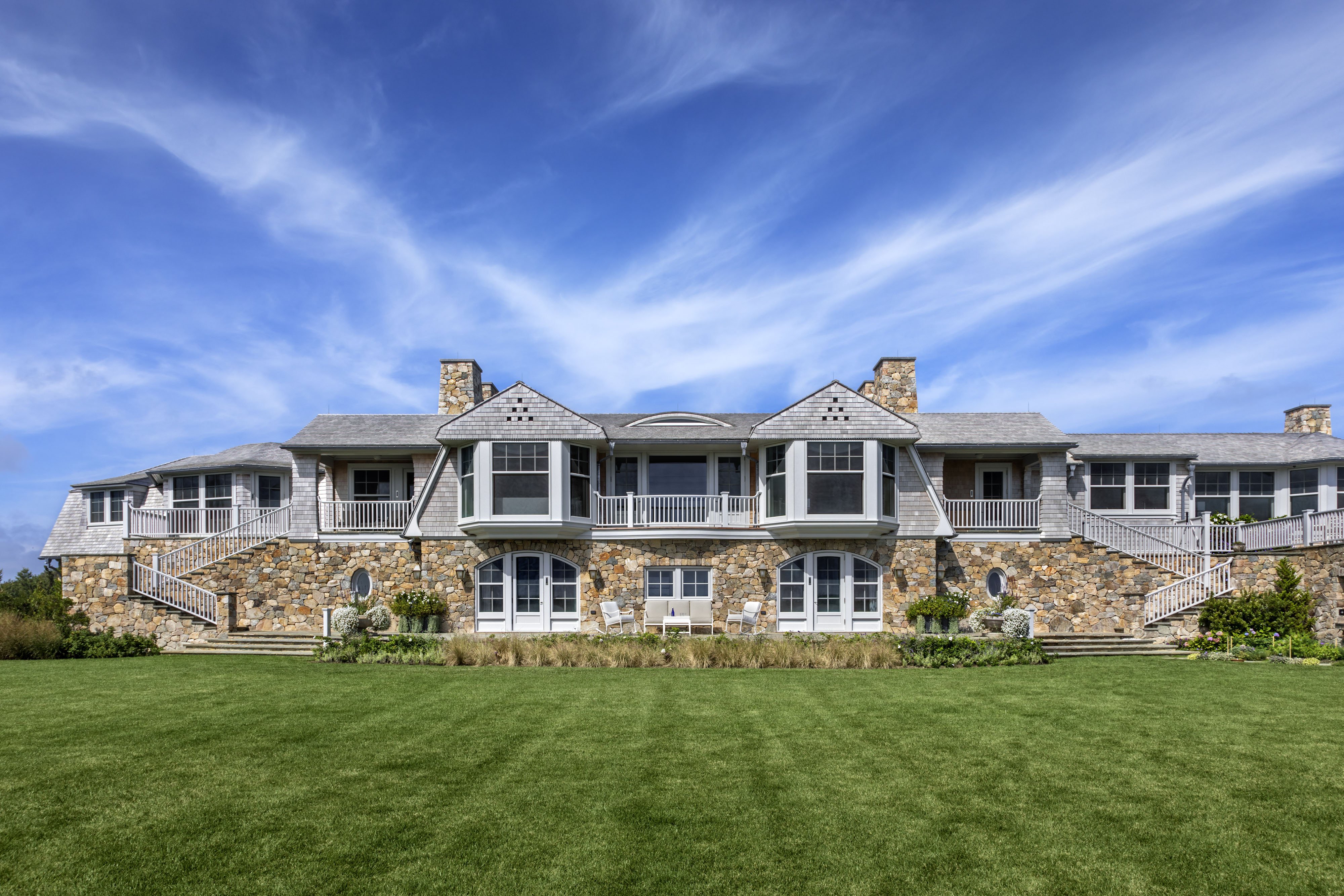 |
Since our clients’ interior sensibilities skew more towards the transitional and contemporary, we agreed with them that the design of this house should be a fresh take on traditional shingled architecture. Its exterior palette of materials is strictly limited to natural wood shingles and rubble stone, with an absolute minimum of painted wood trim; it was particularly inspired by Grosvenor Atterbury’s Robert Weeks de Forest house in Cold Spring Harbor (New York), while its tight-raked gable ends, flared eaves and dormers recall the pared-down shingled houses of such architects as William Ralph Emerson, Wilson Eyre and Bruce Price. Gambrel projections and two “towers” — one of rubble stone with a crenellated roof deck on the entry side, the other shingled and topped by a bell-shaped roof towards the ocean — are strategically placed to relieve the overall length and to reinforce local symmetries at the main facades.
Within, the material palette is just as restrained — match-jointed oak plank walls (pine in the family room/kitchen) and cypress ceilings, with a whitewash finish throughout that emphasizes textures and plays down differences in tone, evoking the timeless informality of a beach house interior left to weather.
 |
Q / Incollect: One thing that particularly stands out in the exterior facades is the use of shingles and fieldstone. Was there historical inspiration for the combination and the gambrel roofline?
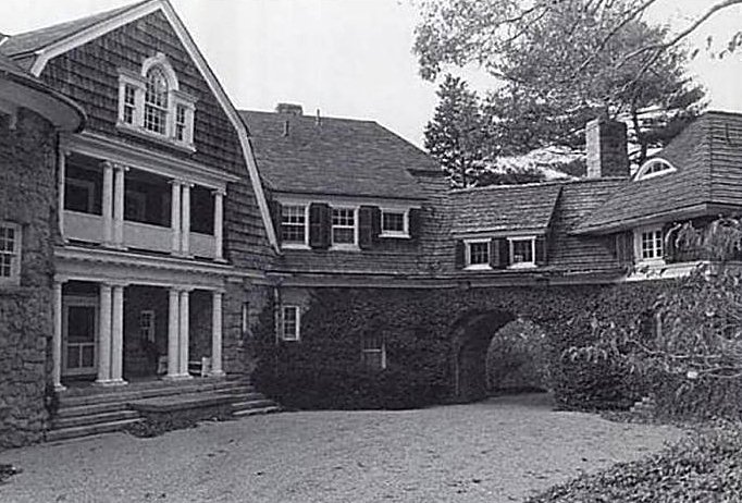 |  | |
Left: Historical inspiration for this fresh take on traditional shingled architecture — Wawapek, Cold Spring Harbor, New York, designed circa 1898 by Grosvenor Atterbury for Robert Weeks de Forest. Right: The simplicity of an exterior material palette of natural wood shingles and rubble stone unifies a bountiful variety of architectural features. Photo by Peter Aaron/OTTO | ||
A / Roger Seifter: The Robert Weeks de Forest house was a particularly apt precedent of a shingled, gambrel-roofed house with a rubble stone ground story acting as its base or plinth. Given the constraints of the local limit on height, the gambrels take up the entirety of the second floor, referencing the region’s 19th-century seaside cottages over its more recent modern glass boxes: most of the rooms on the upper level take advantage of the roof’s volume with trayed and vaulted ceilings.
 |
Q / Incollect: The winding drive does a beautiful job of setting the tone as you approach the house, which is set behind a dune overlooking the ocean. What elements did you use to create a sense of atmosphere before you even see the house?
A / Edmund Hollander: The driveway winds through maritime plantings of Black Pine, Torulosa Juniper, Crepe Myrtle, Beach Rose and summer blooming perennials to create a sense of invitation as one enters the property. By curving the drive it creates a sense of anticipation and mystery, inviting guests to find the house further up the drive.
 |
Q / Incollect: The color palette of the house is refined but still beach-inspired and I love the purple and lavender tones. What can you share about the early design process and the color palette for the house in general? Were you inspired by the client’s main city residence or was this a completely different project?
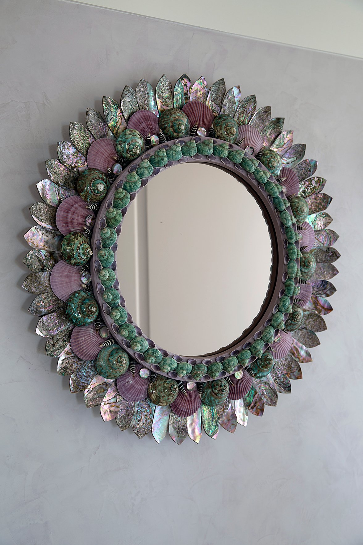 | 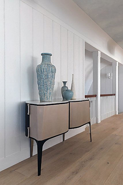 | 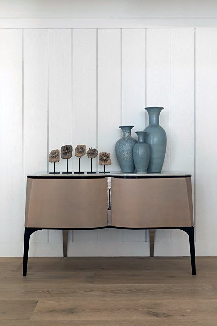 | ||
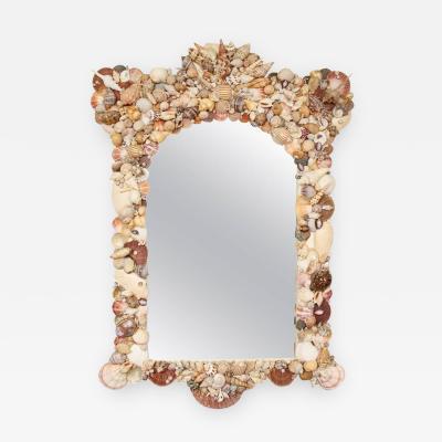
Left: Swiss-born artist Thomas Boog’s intricate shell work mirror was the perfect inspiration piece to usher in the color palette and reference the coastal setting. Center and Right: In the entrance gallery, a pair of Achille Salvagni’s parchment, bronze and marble Antinoo cabinets display midcentury Danish art pottery by Gunnar Nylund. The ceiling is delicate pale blue tinted limed plaster. Photos by George Ross | ||||
A / Mark Epstein: The shell-encrusted natural seashell mirror by the Swiss-born French artist Thomas Boog introduces you to the color scheme. I found it and felt it was just the perfect blend for the location. It was a wonderful way to introduce the lavender of the master suite and the blue of the main areas. I think Boog is one of the few who takes his artistry and uses it in a very special way. The palette was created to be neutral yet reflect the tones of the environment. I’m a strong believer that beige is not the only neutral, that any color used in the right tonal values can be complementary to the site, the art, etc.
We worked with the flooring contractor to find a beautiful shade of driftwood-toned oak, which paired with the natural light kept the home soft and bright. The addition of purple to the pale blues made great sense for two reasons: the client adores it and we had introduced it into their apartment in town. Purple is adjacent to blue in the color wheel and thusly was the perfect complement. The purple was brought in through the most organic of materials — amethyst, Southeast Asian coral, the fior di pesco apuano marble, and of course seashells. The seating area in the master bedroom has a custom-made lavender covered sofa, tub chair, and Parzinger-inspired amethyst-studded and lacquer TV cabinet.
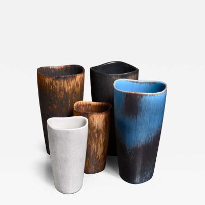
I fell upon the vintage Danish pottery while shopping in L.A. at the beginning of the project. I knew it would be perfect because the clients love the simplicity of midcentury modern shapes. We worked with a very special New York dealer, The End of History who culled pieces from their inventory and found works abroad. The vases atop the Salvagni cabinets are by Gunnar Nylund for Swedish company Rorstrand and date to the 1950s. Gunnar Nylund was the creative director of Rorstrand and all these pieces would have been made for a gallery show and hand thrown and glazed by Nylund. All pieces are unique.
 |
Q / Incollect: It’s obvious that this house was a collaboration since you see details like the gorgeous lilac marble mantle, which must have been a choice made by you, the homeowner and Mark, is that right? Tell us about that process and the other architectural details that make the architecture and interiors so seamless — from the number of different intricate ceiling shapes throughout the house and the elegant but relaxed whitewashed wire-brushed oak walls on the main floor. How did the team make these design decisions?
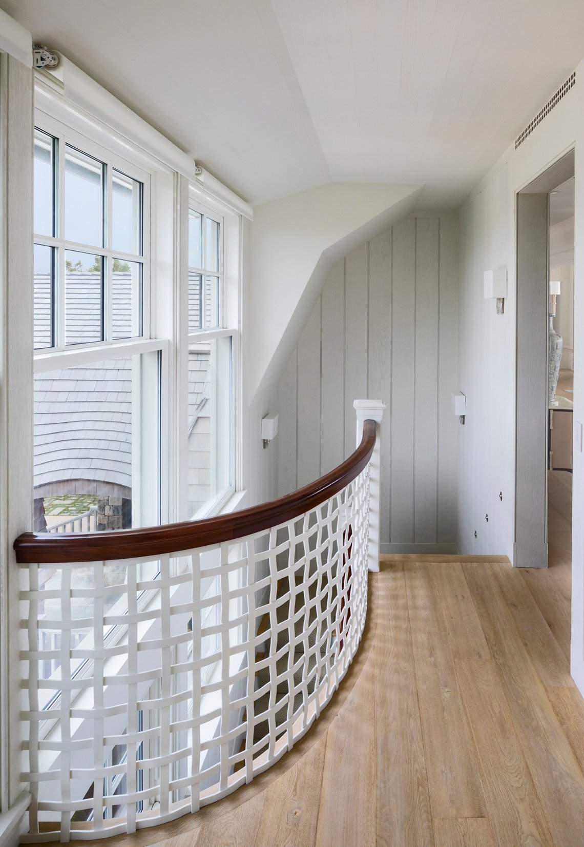 | 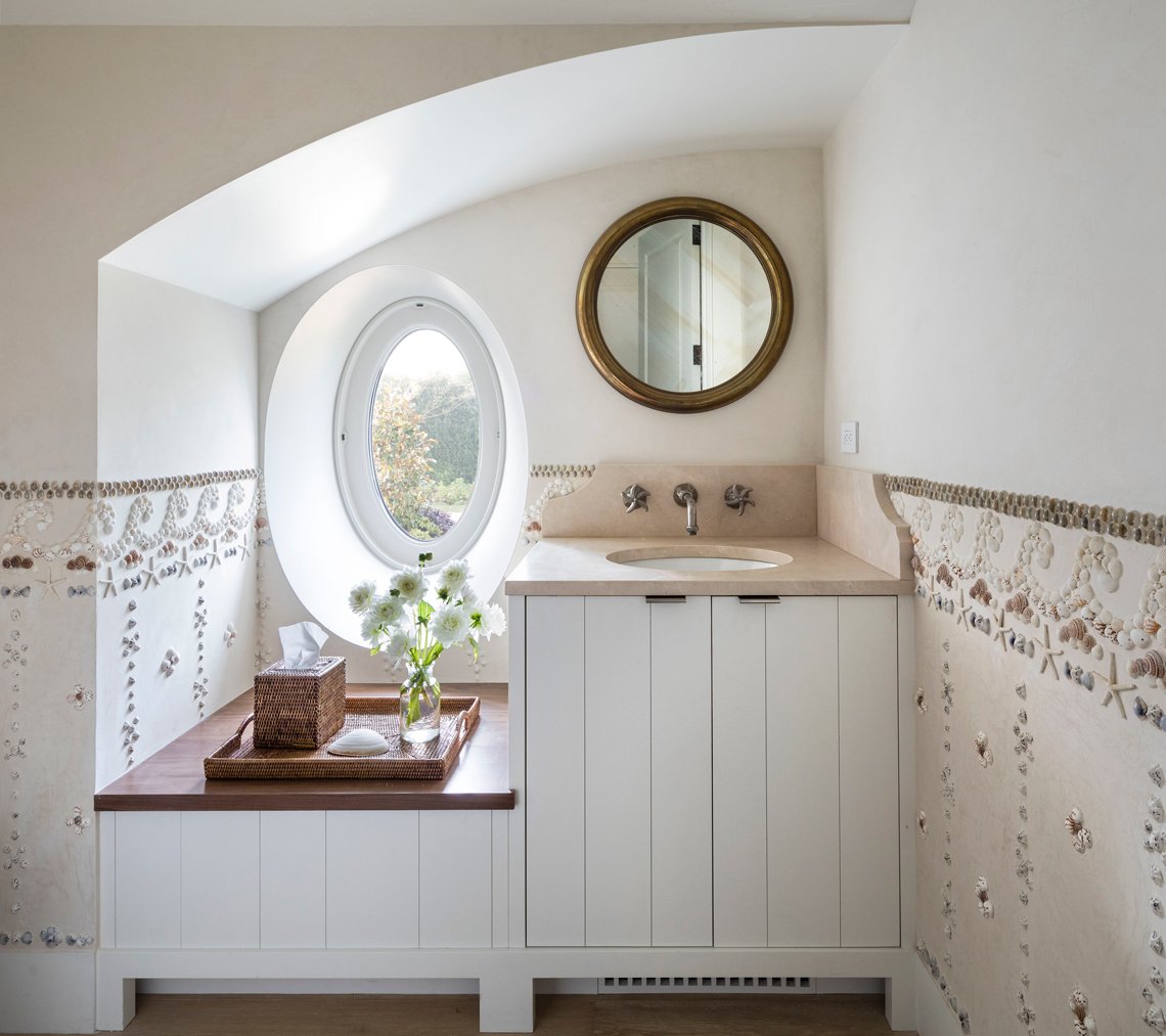 | |
Charming custom architectural and design details — a woven wood lattice stair rail and a powder room with an oeil-de-boeuf window and Venetian plaster walls encrusted with shellwork. Photos by Peter Aaron/OTTO | ||
A / Roger Seifter: Since we collaborated closely and successfully with Mark on the homeowners’ apartment in town, we had an established rhythm for reviewing design proposals and making decisions. As a team, we decided early on that the interior palette of the walls and ceilings in this house should be light, neutral and consistent so that most of the architectural interest and variety — particularly on the main floor — would come from the intricately shaped ceilings, from the over-scaled double-hung “cottage” windows, and from such eye-catching details as the woven wood lattice stair rail and the amethyst-tinged fior di pesco apuano marble fireplace surrounds in the combined living/dining room. While the painted wash on the walls and ceilings makes them a uniform and neutral backdrop and foil for Mark’s furniture and lighting, we took pains to emphasize the materiality of those surfaces by wire brushing the planks.
Given the planning of the main floor, in which many of the rooms flow openly one to the other, the delineation of spaces is reinforced by the formal integrity of their shaped ceilings – ranging from the half-vault of the entry hall, to the tray of the living/dining room, to the bell of the master bedroom.
 | 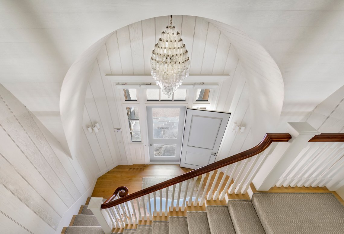 | |
| The variety of shaped ceilings is unified and subtly emphasized by wire-brushed cedar planks with a whitewash finish, chosen to evoke a seaside cottage left to weather in the ocean air. Photos by Peter Aaron/OTTO | ||
 |
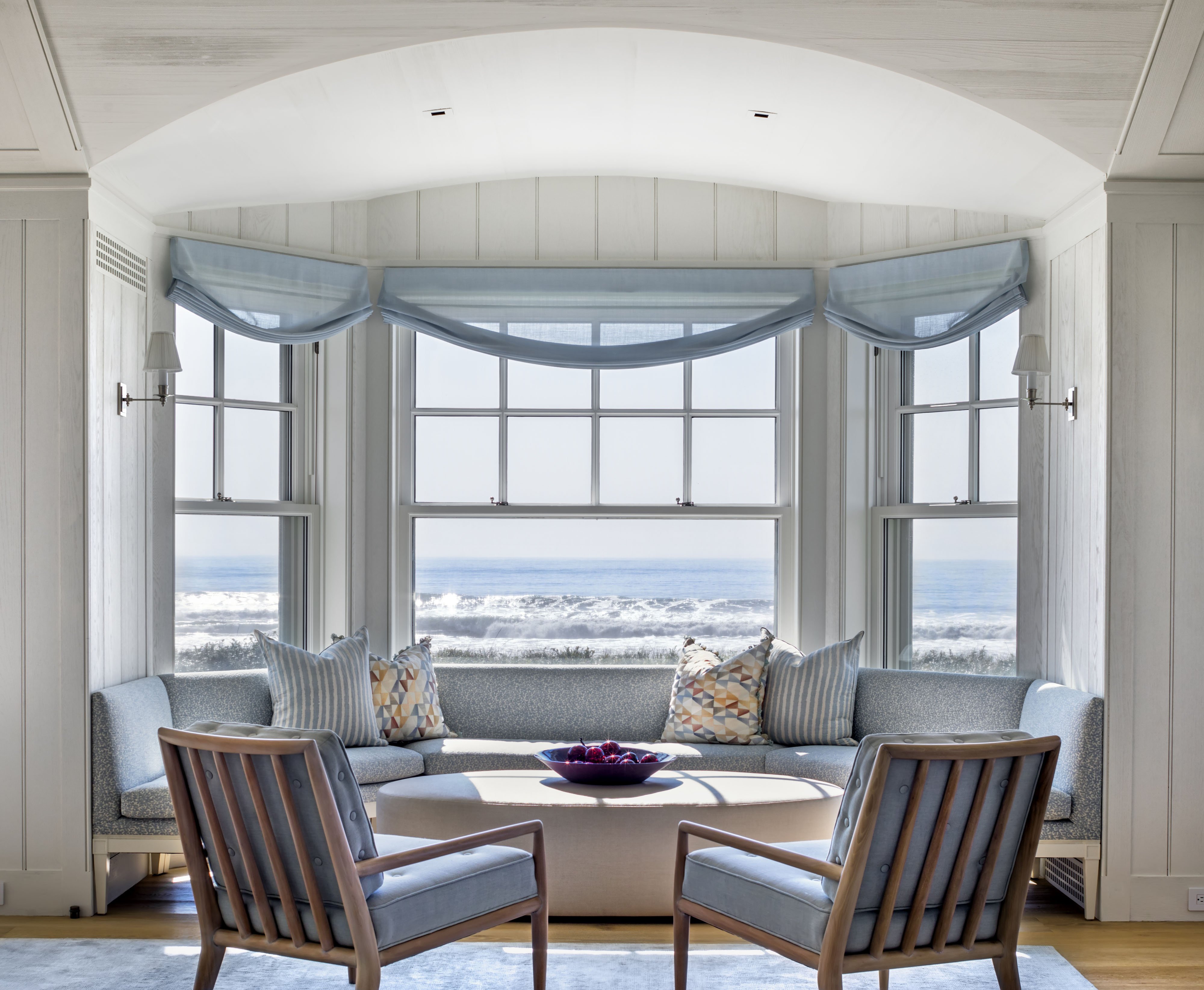 |
| A custom banquette/window seat built into the bay windows invites intimate conversation and mesmerizing ocean views. Photo by Peter Aaron/OTTO |
Q / Incollect: You can tell that this is a family that likes to entertain. Mark, tell us a little about how you decided to lay out the spaces. The great room is 50-feet long and yet is broken up into intimate conversational areas. How does the family use this room and can you give us a sense of some of the distinctive pieces in it?
A / Mark Epstein: Because the living room was so large we broke it up into smaller areas of seating that were individual yet connected. The beautiful bay windows that appear to perch onto the ocean view were outfitted with a custom banquette that unites the furniture with the architecture. A second sofa takes advantage of the proximity to the fireplace. The third sofa acts as a division between the dining and sitting areas. A host of chairs are all carefully curated to be comfortable, relaxed and maintenance free. They complete these areas where two or three people can be engaged in an intimate conversation or as many as 24 or more can gather for entertaining needs.
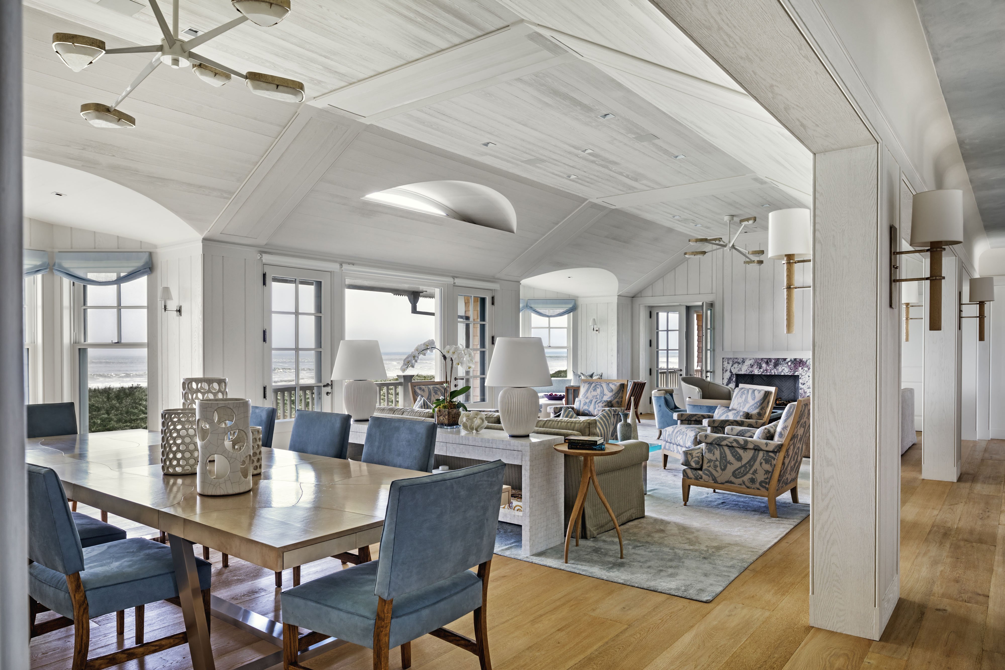 |
Family life unfolds across the expanse of the 50-foot long great room. Illuminated by a pair of Achille Salvagni Spider Jewel chandeliers in a new iteration of the classic, with white enamel arms replacing the original dark bronze, Mark Epstein chose this design for the soft, warm glow from the faceted onyx shades, and for the way they enhance, rather than distract from the beautiful ceiling details. In the foreground, a bleached goatskin table seats up to 16. At the rear of the room, one of a pair of distinctive fior di pesco apuano marble fireplace surrounds, in the client’s favorite lush violet tones. Photo by Peter Aaron/OTTO |
The bleached goatskin table — which seats 16 — is yet again organic and practical, and I designed the leaves at the ends not to mar the simplicity when closed. The eye is drawn up to the amazing ceiling details through the use of a pair of Achille Salvagni alabaster and white bronze spider chandeliers where lacquering the arms allowed them to not distract the eye from the beautiful shapes of the ceiling. Salvagni is again represented in a pair of amazing commodes created in alabaster parchment, onyx and two shades of bronze that hold court in the gallery that runs the length of the living space.
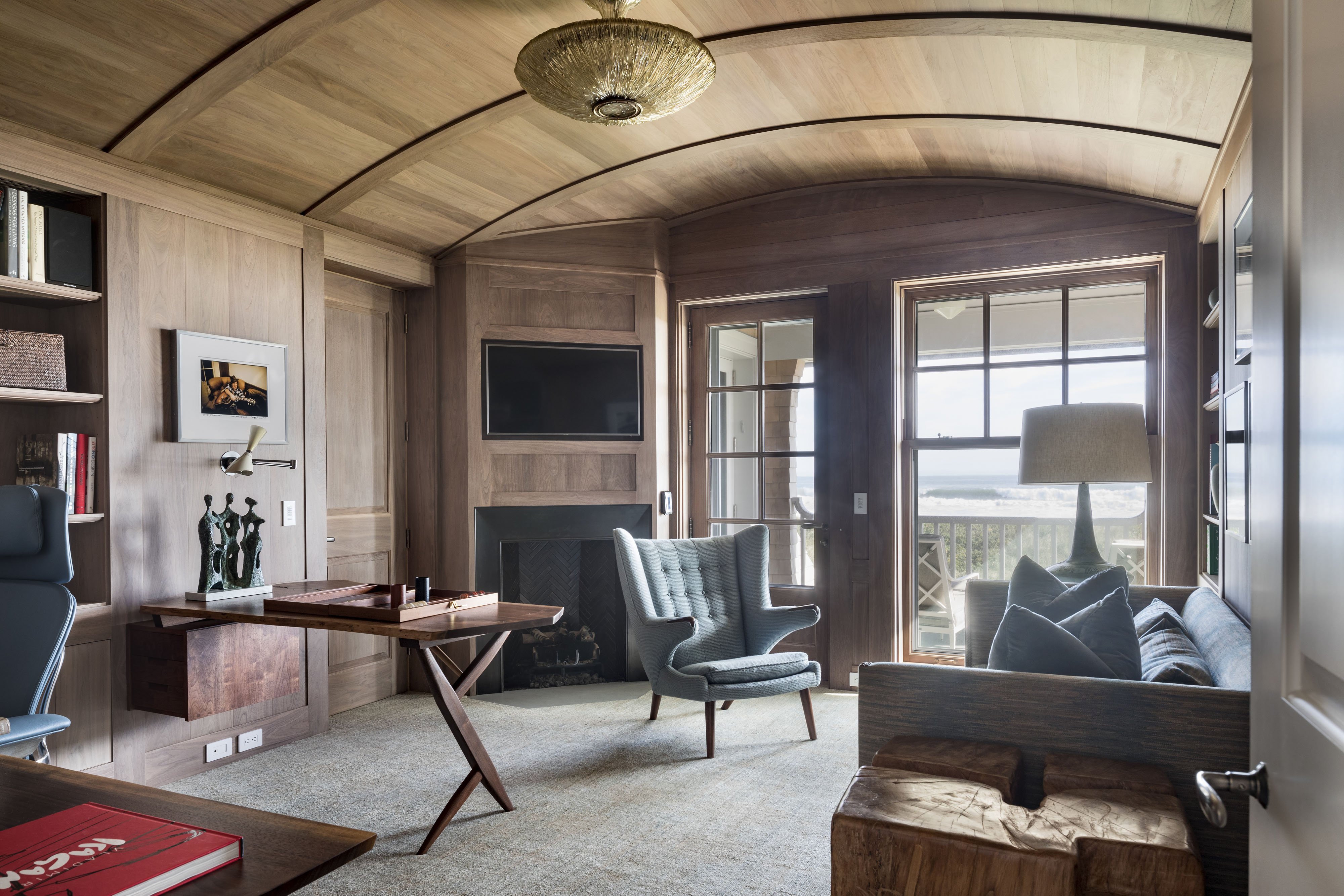 |
| In the study, the barrel-vaulted ceiling is bejeweled by a Barovier & Toso Murano glass pendant. A walnut Conoid desk by George Nakashima and Hans Wegner's Papa bear chair are iconic midcentury designs. Photo by Peter Aaron/OTTO |
 |
Q / Incollect: Like so many modern beach homes, the kitchen is open to the living area, giving the main spaces a more casual vibe. Tell us a little about the general plan and how you walked the line between comfortable and formal.
A / Roger Seifter: The owners wanted an easy and informal layout which combined living and dining in one space, and the kitchen, family room and breakfast area in another. Here the shaped ceilings come into play again, as they give each of these rooms a formal sense and a grand scale that coexist with and even complement the more relaxed aspects of their architecture.
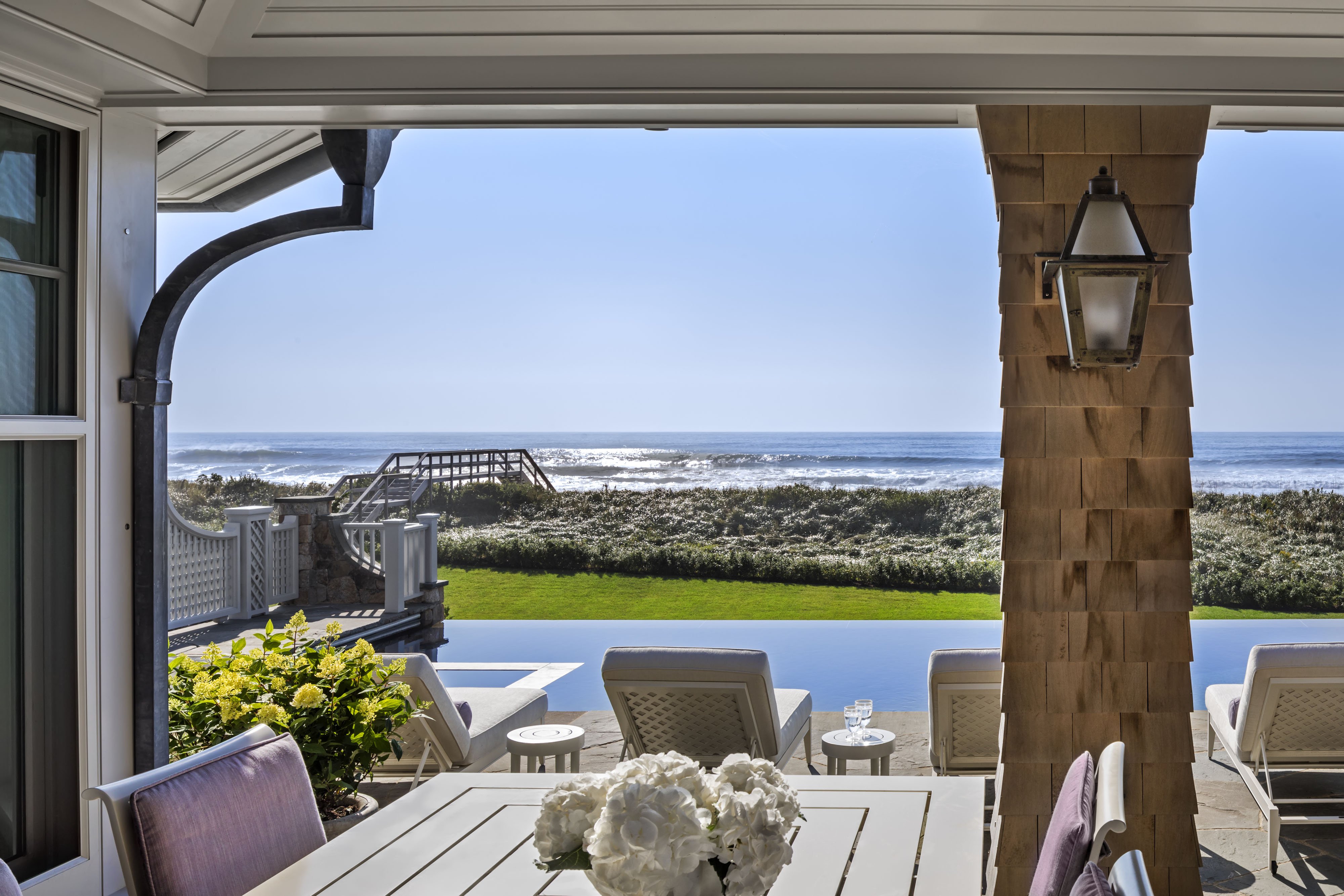
The main floor plan positions these two large areas parallel to the dune and the sea beyond; a wide gallery serves as a connecting spine against the landward side, ending in the master suite at one end and an open porch at the other. The porch is the full width of the house, nearly equal in size to the family room/kitchen, and provides the family with a much-needed and well-used shaded outdoor living space beside the pool.
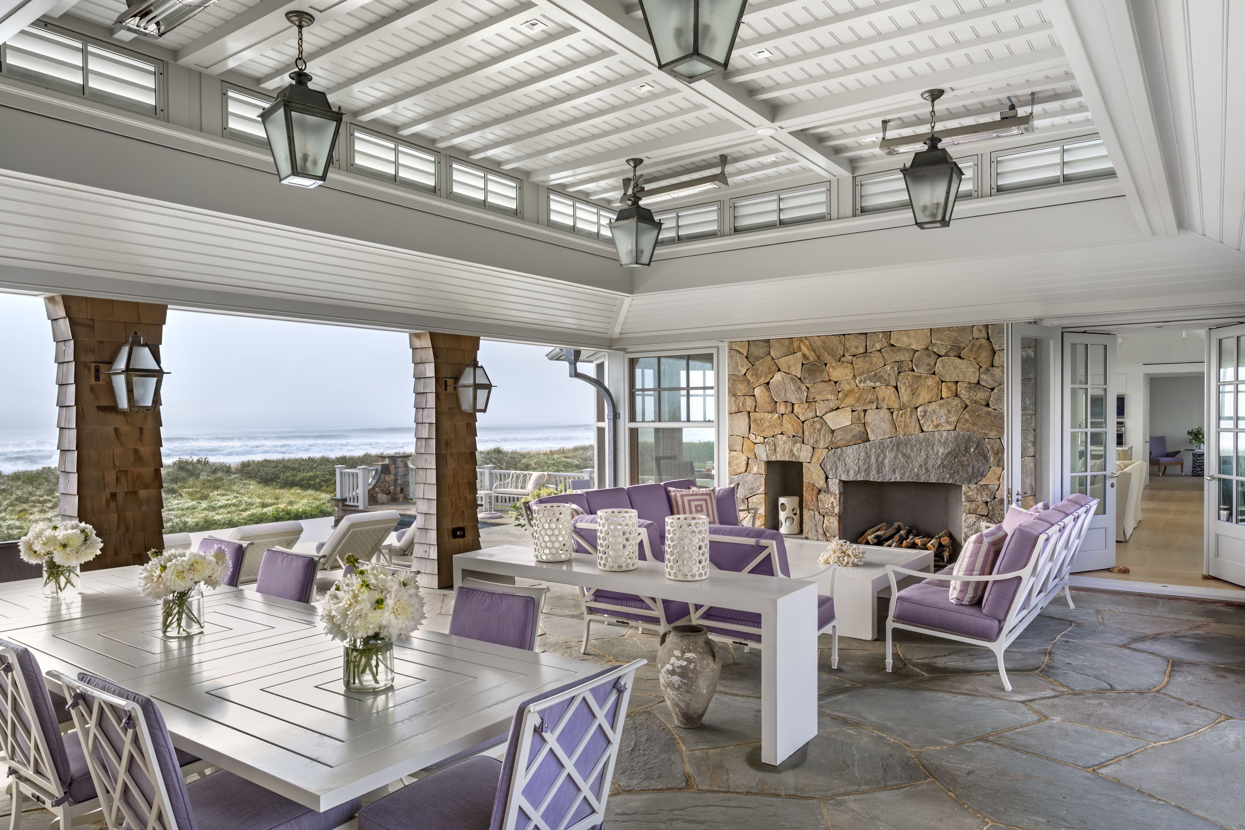 |
Above and below: An open porch offers limitless ocean vistas and cooling sea breezes. It spans the width of the house, with both sheltered and open areas, access to the infinity pool and heated spa, and stairs to the walkway and bridge over the dunes to the ocean. Photos by Peter Aaron/OTTO |
 |
At the master suite, the house is subtly cranked as a means of relaxing the length of the house and of improving the view towards the beach and sea. In every room the view is framed by the over-scaled windows described above; at the center of the living room a floor-to-ceiling picture window heightens the dramatic effect.
 |
Q / Incollect: The house has a nice mix of antiques and new furnishings and plays beautifully with the classically inspired but open architecture throughout. How did the architecture influence your interiors? Can you share some of your favorite pieces in the house? Was there anything the clients insisted on or brought from other properties that you needed to work around?
 | 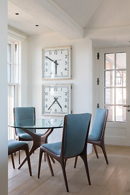 | |
Left: Mark Epstein designed a Swedish-inspired painted cupboard to display the client’s collection of vintage Clarice Cliff transferware in her favorite purple. Mark hunted down the 36 place settings piece by piece over a two-year period. Right: A corner near the kitchen contrasts the organic form of a table and chairs designed by Vladimir Kagan with a vintage 1930s 2-sided station clock. Juxtaposing styles in this way creates a more comprehensive aesthetic. Photos by George Ross | ||
A / Mark Epstein: My main design goal from the beginning was to find special one-of-a-kind pieces that would never interfere with the view or the details of the architecture, but act as a complement. Just one club chair came from a former house, so lots of shopping had to be done. The scale of the house absorbs furniture and I wanted classic pieces that remained fresh as the house ages. Of special note is an L-shaped Swedish-inspired painted cupboard that we designed in the morning room that leads into the kitchen. It houses tabletop accessories, including a personal favorite of mine — 36 place settings of Staffordshire Transferware in the Tonquin pattern by British ceramicist Clarice Cliff, which I spent two years collecting. In the kitchen/family room beyond, as a contrast to the organic shapes of the Vladimir Kagan table and chairs, are a pair of vintage industrial clocks. This blending of sensual shapes and witty pieces created the balance we were looking for. There is very little pattern in the house except for a Loro Piana soutache-embroidered linen fabric. We brought visual interest throughout via textures: Venetian plaster on the bedroom walls, the palest blue limed ceiling in the gallery, the whitewashed walls in the public rooms, embossed stripes on the English pitchers and even the parchment and plaster chandelier above the breakfast table — warm and cozy reigned over slick.
 |
Q / Incollect: How did the overall architectural and interior design of the house influence your garden design? Did the clients come to you with specific desires or did the house itself lead your work?
 |
On the oceanview side of the house, Edmund Hollander designed naturalistic plant beds of sculptural Torulosa Juniper and tousled grasses that wave in the sea breeze, dotted throughout with purple Crepe Myrtle and bright pink Beach Rose. Photo by Peter Aaron/OTTO |
A / Edmund Hollander: Our work was guided and influenced by the three ecologies, which inform everything we do. The natural ecology of the site informed plantings that would thrive in this seaside environment. The architectural ecology of the house, working in collaboration with Roger and Mark, was critical — both forms and materials for the pool area, terrace and beach boardwalk. Finally, the human ecological component — the family — guided us as well in all design decisions.
 |
Q / Incollect: As part of your landscape plan, you went beyond the ocean views, creating an oasis that includes a charming vegetable and herb garden. Tell us a little about those spaces, from the original design to the actual implementation and how the homeowners use them.
 |
The color palette from the interiors was carried over to the landscape, with hues of blue and purple. Photo by Charles Mayer |
A / Edmund Hollander: All of these elements were guided by the homeowners’ desire for a multigenerational landscape, where the family could relax, recreate and grow (both physically and metaphorically). Everything in the landscape is totally organic, including all of the vegetable and herb garden areas.
 |
Q / Incollect: Is there anything we’ve left out that you think is important to the story?
A / Mark Epstein: Our client has been known to call me and tell me this is his special place, where the pressures of life and business go away. It’s his happy place. I’ve known him since he was twelve years old. It’s been so exciting to watch him grow up, raise an amazing family and become a wonderful human being. I’ve created four-plus residences for him and his family and I’m so proud to be part of this project with Roger and Ed.
A / Edmund Hollander: I think the importance of a very close collaboration between our three offices was critical to the success of the project.
 |
SHOP THE LOOK — INCOLLECT FAVORITES BY ROGER, MARK & EDMUND
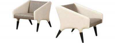
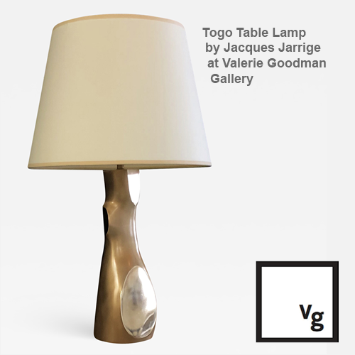
 |  |  |  |