Make it New: Abstract Painting from the National Gallery of Art, 1950–1975
This archive article was originally published in the Autumn 2014 issue of Antiques & Fine Art magazine.
Make It New: Abstract Painting from the National Gallery of Art, 1950–1975, which was on view at the Clark Art Institute in the fall of 2014, examined the different paths taken in abstract painting from 1950 to 1975, and included Abstract Expressionist and Color Field paintings along with works organized by the principles of pattern, texture, and shape. With masterpieces by Jackson Pollock, Morris Louis, Frank Stella, Lee Bontecou, Cy Twombly, Ellsworth Kelly, and others, Harry Cooper, curator of Modern Art at the National Gallery of Art, Washington, D.C. and the lead curator of Make It New, used the occasion to ask how these works, or really any field of works that spans histories and geographies, can be organized. The exhibition, which inaugurates the Clark’s new Tadao Ando-designed Clark Center, reminded us how much “new” is left to be discovered in the past.
COLOR FIELD
Born in Manhattan in 1928, Helen Frankenthaler received her first modernist tutelage at the Dalton School, where she studied with the Mexican artist Rufino Tamayo. She later attended Bennington College in Vermont and worked with Paul Feeley, the artist responsible for making that area a hotbed of activity around Abstract Expressionism and Color Field painting.
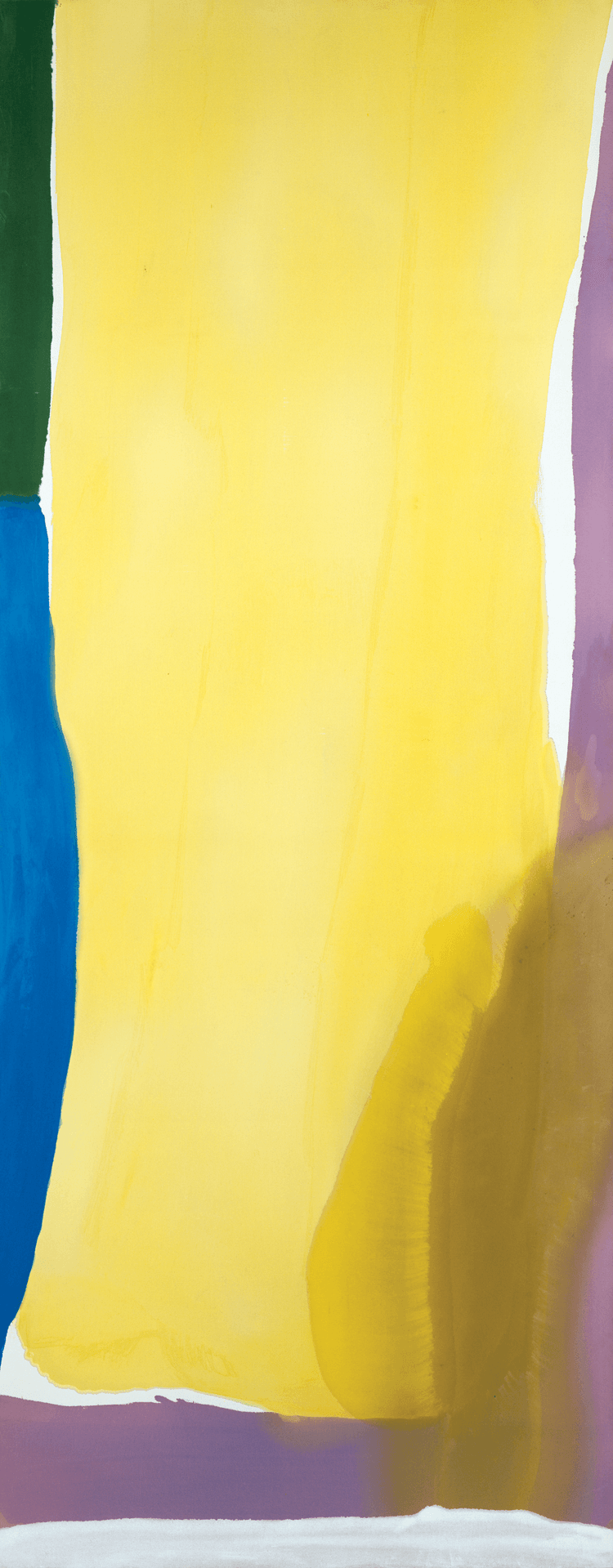
In 1950, a year after Frankenthaler graduated, she organized an exhibition of art by Bennington alumnae in New York City, where she first met the critic Clement Greenberg, with whom she would have a five-year relationship. With Greenberg, Frankenthaler made formative visits to Jackson Pollock’s studio during the period he was executing his Black Paintings. Intensifying and reconfiguring his technique, Frankenthaler began to work directly on the floor using a brush and sponge to assist the seeping of the thinned oil paint into unprimed canvas. Wales refuses the landscape genre that its lyrical colors might otherwise suggest. Contained by a border of violet that envelops both the right and bottom edges of the canvas, a wide corridor of yellow is further bounded to the left by a vertical strip of dark green atop a plunging knife blade of azure. Intermittent passages of bare canvas between color areas read as positive assertions of presence, confounding depth. Yet these claims to boundaries, borders, and surface plenitude are refuted by the haunch of brown that sits upon the violet and yellow like a dirty boot upon a pristine settee, while a stain hovers like a shadow next to the brown. This surprising intervention makes the work hard to pin down, whether materially or emotionally.
ABSTRACT EXPRESSIONISM
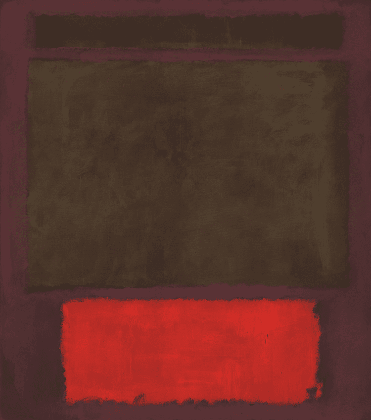
Of all the artists associated with the New York School, Mark Rothko is arguably the most intriguing to those not ordinarily inclined toward abstraction. In No. 1, the pulse of red paint near the bottom edge has an almost infrared intensity that summons us like a beacon, stealing our attention away from the dark gray-green shapes hovering just above it, which are sunk into a maroon ground of similar darkness. The central shape, which is both the largest and the most thinly painted, is the hardest to discern, a smoky rectangle barely defined by its darker, slightly contracting outline. Rather than staging a revelation of color, what No. 1 seems to disclose is the enigmatic presence of shadow, the device by which objects (ironically absent here) are normally depicted, or obscured, in pictorial space.
With Rothko, like Jasper Johns, paradoxical intuitions are sparked not by everyday objects but are raised to a more elusive level, one nicely captured by one of Rothko’s own remarks: “Often towards nightfall, there’s a feeling in the air of mystery, threat, frustration—all of these at once. I would like my paintings to have the quality of such moments.”
PATTERN
Born in Matsumoto, Japan, in 1929, Yayoi Kusama moved to the United States in 1957 after corresponding with the American artist Georgia O’Keeffe. She first settled in Seattle, where she lived for a year before making New York her home. Kusama remained there until 1973, when, suffering from psychological disturbance, she decided to return to Japan.
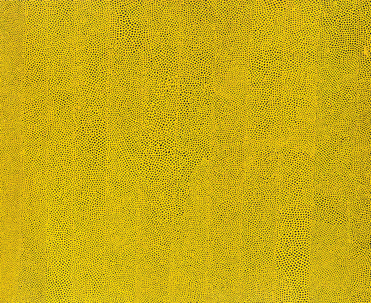
Kusama has suggested that her Infinity Net paintings—which started in the 1950s and continue into the present—are manifestations of recurring hallucinations that obscure her vision with an overlay of dots and nets. However, this autobiographical explanation should be taken with a grain of salt, given the evident sensitivity and care with which the nets are rendered. The honeycomb structure of Infinity Nets Yellow confounds the viewer’s effort to trace the relationship between yellow and black. Although there appears to be a series of broad vertical bands spanning the 1960 painting, the breeding specks of black and the membrane-like sacs of chicken-fat yellow that enclose them upend any sense of larger organization, while subtle alterations in the scale and density of dots disabuse any notion of uniformity.
Overly psychologized readings of Kusama’s practice interpret her paintings as direct expressions of her experiences of depersonalization and breakdown. And yet the paintings seem to express, even to predict, our contemporary reality of interpersonal connection (via the aptly named Web).
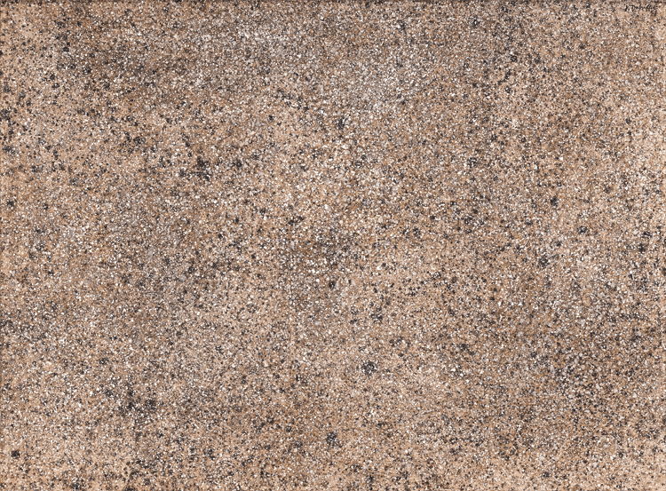
- Jean Dubuffet (French, 1901–1985), Confiture matière lumière (Texturologie LIII) [Preserves of Light and Matter (Texturology LIII)], 1958. Oil on canvas, 39 x 52⅛ x 1⅜ in. (97 x 130 cm). National Gallery of Art, Washington, D.C. Gift of the Stephen Hahn Family Collection, 1995.29.9 © 2014 Artists Rights Society (ARS), New York / ADAGP, Paris
TEXTURE
Although he was briefly an art student, Jean Dubuffet’s training began in earnest in 1923 when he chanced upon Hans Prinzhorn’s Artistry of the Mentally Ill—an illustrated dossier of psychiatric case studies that Dubuffet would study for years. In 1944, his suite of demented-looking portraits and genre scenes scandalized the public and cemented his reputation among French intellectuals. Dubuffet’s art brut—literally “raw art”—reawakened the modernist-primitivist impulse with a vengeance, tying it to the misérabilisme of postwar France and announcing madness to be an authentic source of artistic expression.
Dubuffet remained a committed figurative painter, and an inventive one. Yet, for a three-year period in the late 1950s, he completed two series of paintings—the Matériologies and the Texturologies—that mulled over the possibilities of allover, monochrome abstraction. While the former series incorporated earth and other natural materials into dense agglomerations, Dubuffet made this and other Texturologies by holding a loaded brush just above the canvas and shaking it so that a fine spray of paint droplets rained down, stippling the surface with a flickering micro-texture. The result is poised somewhere between abstraction and a close-up (or is it a distant aerial?) view of the earth.
Despite Dubuffet’s having claimed an artisanal lineage for this technique—time-honored “Tyrolean” stone masonry—it can also be read as a rarified rendition of Jackson Pollock’s dripping. Dubuffet deployed Pollock’s innovative method backward, so to speak, via a fussy artisanal process that atomizes and homogenizes the painterly mark rather than celebrating it (as Pollock did).
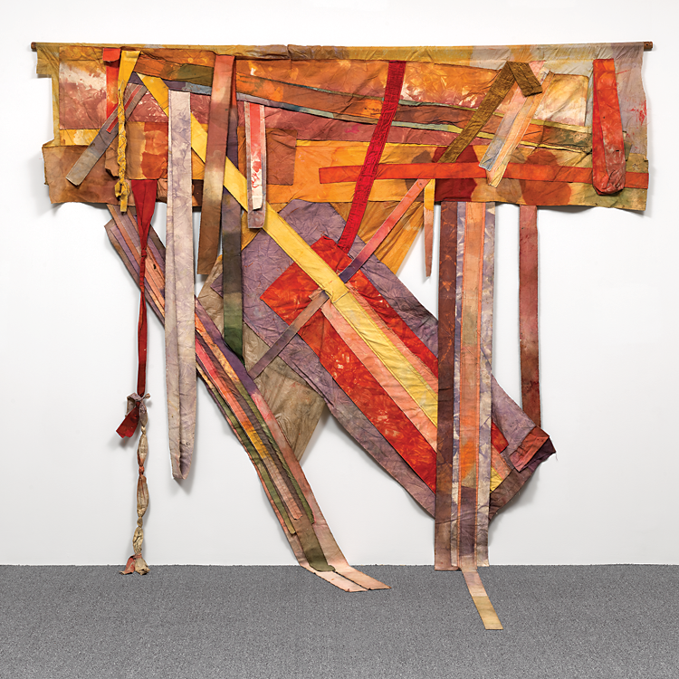
- Al Loving (American, 1935–2005), Brownie, Sunny, Dave, and Al. 1972 (later revised). Mixed media (stained canvas, torn, cut and sewn; wooden rod), 174 x 132¾ in. National Gallery of Art, Washington, D.C. Pepita Milmore Memorial Fund (2013.61.1), © Estate of Al Loving, courtesy Garth Greenan Gallery, New York.
SHAPE
Born in Detroit in 1935, Al Loving attended the University of Illinois and received a master of fine arts from the University of Michigan in 1965. In 1968, Loving moved to New York City, where he spent much of his life and professional career. He came to prominence only one year later, in 1969, when he had a solo exhibition at the Whitney Museum of American Art—a noteworthy achievement for any artist, but particularly given Loving’s youth (he was thirty-four at the time) and the fact that he was the first African American to receive such a distinction at that museum.
The work he was making during this period was indebted to Hard Edge and Color Field painting, a studied marriage of Frank Stella and Kenneth Noland. Like Sam Gilliam, Loving pointedly refused the pressures on black artists to paint so-called black subject matter. However, Loving soon became dissatisfied with the limits of what he saw as a circumscribed practice. He said, “I felt stuck inside that box; I mean, this was 1968—the Democratic Convention, this was the war—and I’m doing these pictures.” He also said that he wanted to determine “whether there is black art and what it looks like.”
Loving’s efforts to break out of the “box,” as seen in works like Brownie, Sunny, Dave, and Al, attests to the fact that this rejection of “pictures” was a refusal of tired form, but not of the protean language of abstraction itself. In this piece, stained strips of canvas and cloth are stitched into something that resembles a flag that has lost nation and decorum, a banner refusing coherence and legibility. Descending onto the floor, the piece seeks an alternative to the repressive tolerance of the wall. An acceptance of craft compels the viewer toward other—particularly gendered—genealogies of the modern, from quilting bees (his mother and grandmother were quilters) to African wall hangings. What is it to reject ordinary beauty, to turn one’s back on symmetry, to adopt strained and withered colors? Can one answer that question with both optimism and invention? This is the affective power of Loving’s visual wager.
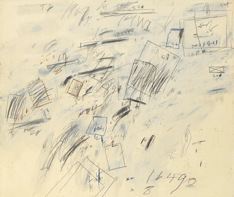
By the late 1960s, Cy Twombly had cleaned up the florid colors and four-letter words that had made his work notoriously unpalatable to American audiences. Scurrilous, imbecilic drawings were replaced with blocks of computation and drafting. According to Kirk Varnedoe, the artist was engrossed with the details of the Apollo program throughout the summer of 1969. Working in near seclusion in a house overlooking a volcanic crater might have encouraged Twombly to ruminate on the mission to the surface of the moon. In Untitled (Bolsena), a flotilla of rectangles fan out over a thin white ground, tumbling weightlessly in a roughly diagonal vector. Drawn with a freehand brevity, the forms are organized according to the disparities in their sizes in a manner suggestive of spatial recession, as if the picture were plotting the trajectory of a single shape at successive points. The numerical notations pencilled around the edges of the shapes promise to resolve that question and clarify the ordering system, but that is precisely what these ciphers do not do. The only numbers that unambiguously signify anything within this field of homeless quantification are those that point offscreen, back to the factual properties of the painting: its year (1969) and perhaps the measurements of the rectangles themselves.
Make It New: Abstract Painting from the National Gallery of Art, 1950–1975 at the Clark Art Institute, Williamstown, Mass., August 2–October 13, 2014, was organized by the National Gallery of Art, Washington, D.C. in collaboration with the Clark Art Institute, and curated by Harry Cooper, curator of Modern Art at the National Gallery of Art, Washington, D.C., with David Breslin.
David Breslin is associate director of the research and academic program and associate curator of contemporary projects at the Clark.
Matt Jolly is a Ph.D. candidate in the history of art and architecture, Harvard University.
This article was originally published in the Autumn 2014 issue of Antiques & Fine Art magazine, which is affiliated with Incollect.


