


“My Dear Mr. DuPont…”
Connoisseurship of Maps at Winterthur
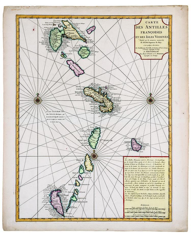
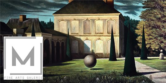
When he collected maps, Winterthur Museum founder Henry Francis du Pont brought to them the same discerning eye for color, form, and verity he applied throughout the collection. His correspondence with dealers was always polite though brief; understandable, given the sheer number of “rarities of every description” offered to him for sale. The letters also indicate du Pont’s curiosity about certain material aspects of maps—their format for display and early color.
Early American and European printed maps of a larger size were generally wall maps, folding maps, or bound in atlases. When du Pont inquired about the appropriate sort of frame for a wall map from 1631, he was surprised to learn that framing was a relatively modern convention for such maps. As one dealer aptly explained “My Dear Mr. du Pont . . . The scarcity of earlier frames is due not only to their having been destroyed through having fallen into bad condition, etc., but also to the fact that there were probably very few prints framed and hung in the homes of the early colonist, due to the difficulty of obtaining glass to cover them.” 1 In the seventeenth and eighteenth centuries in England and the colonies, prints were sometimes varnished and adhered directly to walls, without glazing or frames, while large wall maps would likely have been varnished, lined with cloth, and attached to turned or carved wooden rollers.
In his correspondence about the prospective purchase of the 1631 map (which he did not end up acquiring), du Pont was very clear: “I would like to have your assurance in writing that it has the original coloring, etc., before I actually put it in my room [possibly Winterthur’s Hart Room].” 2 Du Pont’s query was not without merit. Determining whether a map or a print has early color is a topic that has challenged conservators, curators, and collectors alike.
|
|

Maps, like other prints, were sold either plain or hand colored, the latter adding both decorative enhancement and commercial value. Hand applied color was generally watercolor; a mixture of ground pigment in a binder such as gum Arabic, mixed by hand in vials or shells, or—after 1766—available in cakes. Determining when hand color was applied is generally not possible, though certain aspects of color palette, paper manufacture, and condition are consistent with early color. For instance, maps with early color would have had a generous application of sizing, generally gelatin, to provide a sufficient coating to contain the watercolor so that it would not bleed laterally or sink through the sheet. Papers intended to receive hand color, as with printed medical illustrations and maps, would have gone back to the paper mill,3 or on to the publisher or print seller, after intaglio printing to receive their “hard” or heavy coating of sizing before hand coloring. Since the coloring of maps and prints was also a genteel pastime, instruction manuals for applying sizing at home included recipes for starch, alum water, and isinglass. In addition to sizing, a particular palette was described for the early color of maps. Artists manuals, such as John Smith’s The Art of Coloring in Oil cite such colorants as a tincture of myrrh for hills, towns with red lead, and a series of colors to denote provinces.4
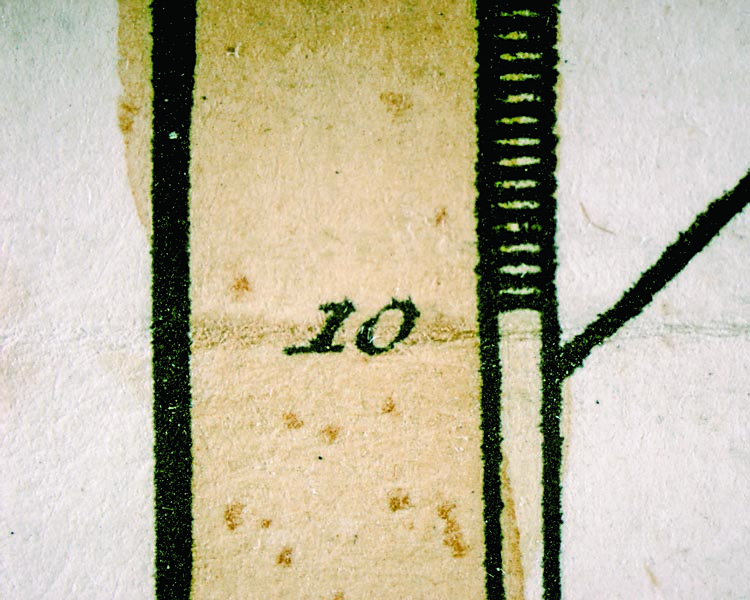
The complication is that modern colorists are still applying color to antique maps using traditional materials and techniques. Scientific analysis can determine the presence of some modern colorants, but often there is no clear evidence.5 Close inspection, however, can reveal aging in situ of some colorants, such as the copper-based verdigris (popularly called the burning green) known for its tendency to oxidize, altering adjacent colors or causing brown stains on the verso of the sheet. Aging of the hand coloring should appear commensurate with the surrounding aging and deterioration of the paper (Fig. 1). Later or modern color is sometimes evident in damaged areas such as folds, creases, tears, and even foxing spots, which are often more absorbent. These areas can show the pooling and intensification of watercolor, suggesting application of color after the paper was damaged or worn (Fig. 2). Examination under magnification can also reveal the modern hand in later or modern outlines and border color (Figs. 3 and 4).
|
|
.")

Henry Francis du Pont corresponded with experienced dealers as well as curators prudently considering the maps offered to him. But, in the end, he had a house to furnish and the aesthetic harmony of each room was a top priority. If a map did not complement the room he had in mind for it, he did not buy it. Today, despite these constraints, his careful selections offer opportunities to gain a better understanding of early maps.
All images courtesy of Winterthur Museum, Garden & Library.
1. Letter from Harry Shaw Newman, November 21, 1939.
2. Letter to Harry S. Newman, c/o The Old Print Shop. November 15, 1939. Winterthur Museum, Library, and Garden, Winterthur. Delaware.
3. John Bidwell. “The Brandywine Paper Mill and the Anglo-American Book Trade 1787-1837,” Diss. University of Oxford, 1992, p. 141.
4. Nancy Purinton in Dear Print Fan: A Festschrift for Marjorie B. Cohn, ed. Craigen Bowen, Susan Dackerman, and Elizabeth Mansfield (Cambridge, Mass.: Harvard University Museums, 2001), 258–260.
5. This has been borne out by recent analysis by Catherine Matsen , Winterthur Associate Scientist, of several maps with suspected later or modern color at Winterthur’s Scientific Research and Analysis Laboratory. Elemental analysis of the colorants with XRF (x-ray fluorescence) spectroscopy detected elements consistent with pigments available at the dates of manufacture of the maps; no elements were detected to indicate the presence of modern pigments. In situ molecular analysis of the map colorants with Raman spectroscopy was not successful given interference from the paper substrate and low pigment concentrations.